Having played around with CSS Grid for a while, I had been very impressed with it. But having watched this excellent video on the use of grid areas, I realise that I have been holding the hammer by the head.
Despite reading about grid areas, it hadn’t sunk in just how easily they can be used to solve basic layout requirements – especially when handling responsive layouts.
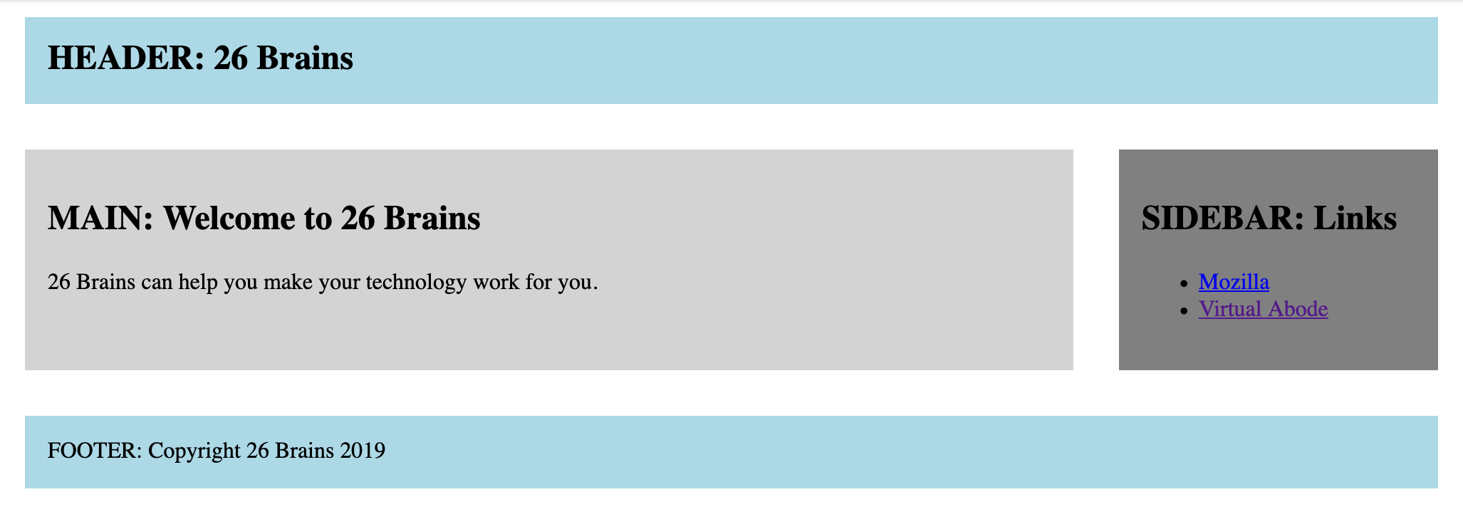
To help myself, I created a small Codepen demo, using the least CSS and HTML I could to recreate a basic 2 column layout that collapses to 1 column on smaller screens.
The result can be seen in this Codepen.
The HTML becomes very, very simple:
<!DOCTYPE html>
<html>
  <head>
    <link rel="stylesheet" href="style.css" />
  </head>
  <body>
    <div id="site">
      <header><span id="company-name">HEADER: 26 Brains</span></header>
      <main>
        <article>
          <h1>MAIN: Welcome to 26 Brains</h1>
          <p>26 Brains can help you make your technology work for you.</p>
        </article>
      </main>
      <aside>
        <h2>SIDEBAR: Links</h2>
        <ul>
          <li><a href="https://www.mozilla.org">Mozilla</a></li>
          <li><a href="https://www.virtualabode.com">Virtual Abode</a></li>
        </ul>
      </aside>
      <footer>FOOTER: Copyright 26 Brains 2019</footer>
    </div>
  </body>
</html>
Similarly, the CSS is very readable and straightforward:
body{
  margin: 0;
}
/* small screen style by default */
#site{
  display: grid;
  grid-template-columns: 1fr;
  grid-template-areas:
    "header"
    "main"
    "sidebar"
    "footer";
}
header{
  grid-area: header;
  background-color: lightblue;
}
#company-name{
  font-weight: bold;
  font-size: 1.5em;
}
main{
  grid-area: main;
  background-color: lightgrey;
}
aside{
  grid-area: sidebar;
  background-color: grey;
}
footer{
  grid-area: footer;
  background-color: lightblue;
}
header, main, aside, footer{
  margin: 0.5em;
  padding: 0.5em;
}
/* override to target big screen */
@media (min-width: 1024px){
  #site{
    text-align: left;
    width: 1024px;
    margin: 0 auto;
    display: grid;
    grid-template-columns: 3fr 1fr;
    grid-template-areas:
      "header header"
      "main sidebar"
      "footer footer";
  }
  header, main, aside, footer{
    margin: 1em;
    padding: 1em;
  }
}
The key part in the CSS is this:
YOUR_CONTAINER{
  grid-template-columns: 3fr 1fr;
  grid-template-areas:
    "AREA-1-HEADER AREA-1-HEADER"
    "AREA-2-MAIN AREA-3-SIDE"
    "AREA-4-FOOTER AREA-4-FOOTER";
}
YOUR-CONTENT{
  grid-area: AREA-2-MAIN;
}
In the above CSS, we have defined 2-columns; the first will be 3x the width of the second. In the area below, each line represents a row and on each line, you will see a pair of area names. For the header and footer areas, the names are the same. For the middle row, the left column has the name AREA-2-MAIN and the right column has the name AREA-3-SIDE.
To make your content appear in one of the area, simply give assign the appropriate name to the grid-area CSS property.
I’ve illustrated the control this provides over responsive layouts and you should note that I’ve made the small screen layout the default layout with the large screen variant defined in the media query.
I think I’ll be trying to make more, and better, use of CSS Grid.
Further reading on CSS Grid:
